
A logo's worth a thousand words
Little green blocks, a crest in Pantone 349 with yellow wheat sheaves in Pantone 116, and words rendered in Myriad Pro type, regular, semi-condensed or condensed. Individually, this is a rather disparate collection of elements but combined in the right way, they carry a powerful message that says, this is the University of Saskatchewan.
By Colleen MacPherson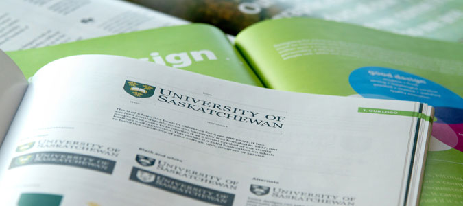 Ensuring that message is clear and consistent is the aim of the university's recently released Visual Expression Guide, a how-to for using the U of S crest, wordmark, colours and graphic elements. "We want our visual identity and our messages to reflect who we are, to reflect our brand," said Ivan Muzychka, associate vice-president of communications. "The idea is not to create monolithic uniformity but rather to create consistency that serves to enhance our university's reputation."
The Visual Expression Guide offers detailed do's and don'ts along with ideas for using the logo, type and graphic elements in diverse and creative ways. The aim, said Muzychka, is to always create materials that have a similar "look and feel" that people will come to associate exclusively with the University of Saskatchewan.
For Brian Kachur, creative services specialist in marketing communications and creator of the guide, providing inspiration is as much a part of the document as information.
"We used examples of work by designers across campus to give the widest possible representation of U of S materials and to showcase the skill level we have here," said Kachur. "Design can sometimes get stuck in repetitive mode and the result can be a little boring so we hope all of the good work we've included will keep the brain churning. We want people to keep looking for creative solutions and producing quality materials rather than get stuck in the guidelines."
The guide is a visual feast with many more pictures than words, an intentional result on Kachur's part. "When you're explaining things visual, the easiest way to do it is visually. A picture's worth a thousand words so the images often explain themselves."
It has taken some time to develop the guide, said Kachur. University designers have been working with the new green squares, a graphic element representative of the prairie landscape, since 2010. "We now have a good idea of what works and what doesn't," he said, but as with all things creative, the boundaries are broad. "We'll continue to explore and find creative solutions that work and that's what will keep our brand fresh. It's not about re-branding; it's about continually improving what we have."
Muzychka said the guide will be valuable to everyone on campus involved in producing materials for the university but also to outside suppliers—designers, sign makers—who undertake work for the U of S.
The new guide serves as a complement to the university's Editorial Style Guide and various design templates, said Muzychka, and more work is underway. "We're embarking on bringing consistency to our sub-brands, those units that have an individual identity and don't necessarily fall completely under the overall brand guidelines.
"We want to ensure that units that are sub-brands reflect a strong association with the University of Saskatchewan and I think we can do that without these units losing their identity."
Guidelines are also in the works for ensuring consistent visual identity for the U of S on the web, he added.